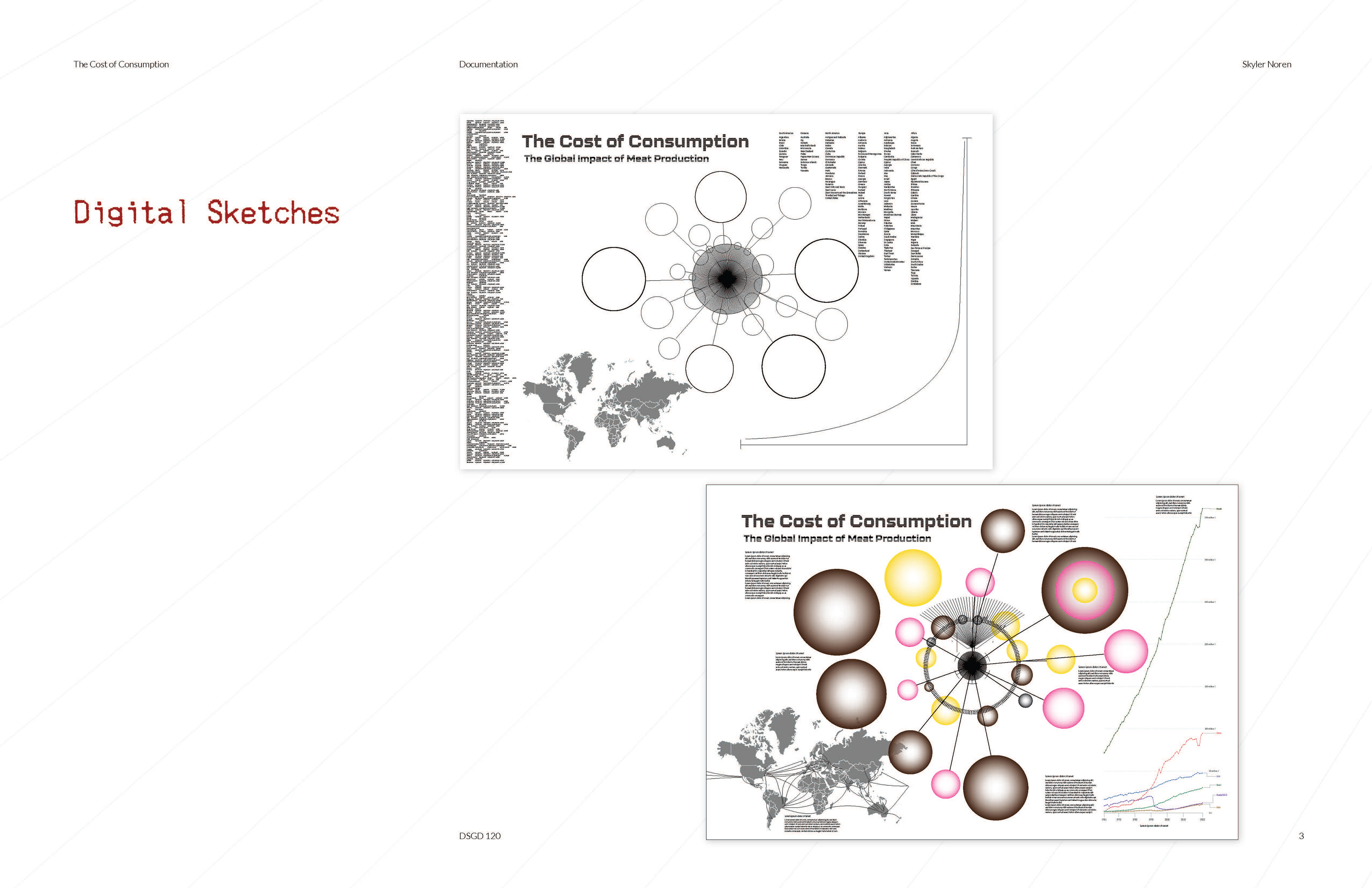


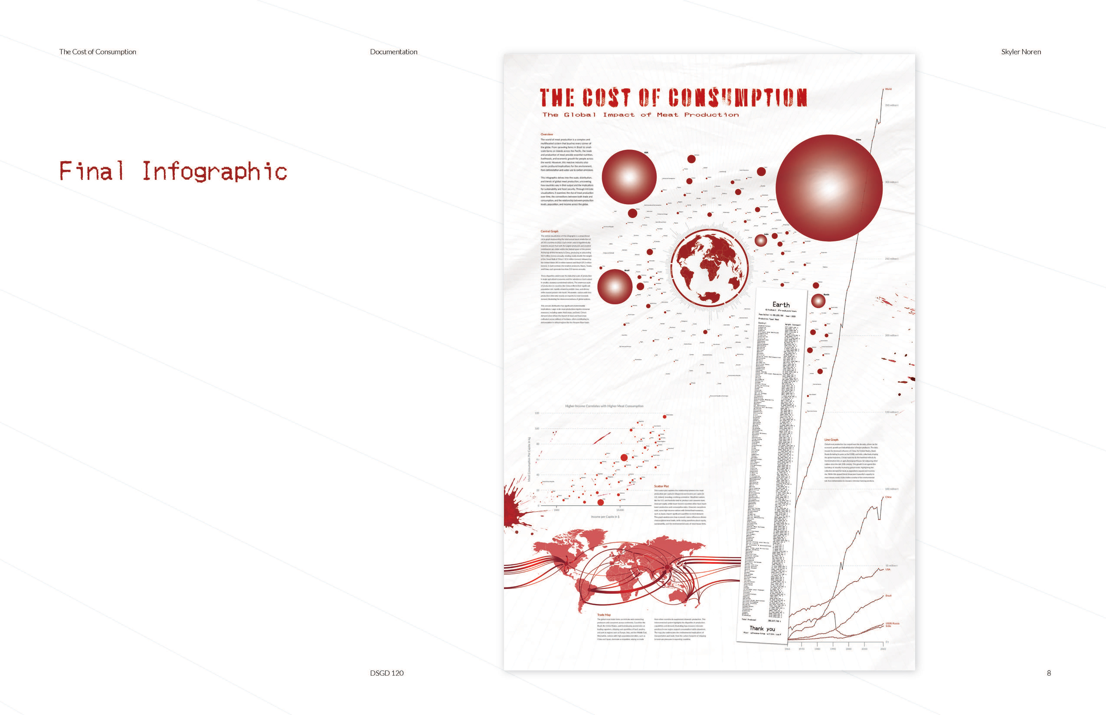


Drawing inspiration from data-driven storytelling, I created an infographic that visualizes the global scale of meat production. Proportional circle graphs, trade maps, and trend analyses highlight the stark contrasts between different countries and the environmental impacts they have on our world. To address the vast size disparities in the data, I converted the main dataset logarithmically, ensuring the proportional sizes of different nations were accurately represented while fitting cohesively onto the infographic. This project reflects my growth as a designer and my ability to translate and present complex information in an engaging and accessible way.